Agency · Corporate Site · 2024
Blue Ratio
Corporate brand site with editorial motion language and case-study deep dives.
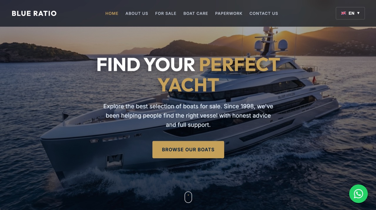
Marketing site for a growing agency. Each section establishes its own micro-rhythm — service cards expand on hover, case studies open into long-form scroll, contact form bound to subtle accent transitions.
The Problem
A growing agency was pitching high-end work with a site that didn't reflect its own standards. Services and case studies were buried in static pages, and the contact flow felt like an afterthought.
The Solution
A corporate site with an editorial motion language: service cards expand on hover, case studies open into long-form scroll layouts, and the contact form responds with subtle accent transitions. Each section keeps its own micro-rhythm, so the site reads like a publication.
What I Built
- →Hover-expand service cards with staged reveals
- →Long-form case study layouts for deep dives
- →Contact form bound to accent-driven micro-states
- →Section-level motion rhythm tuned per content type
Highlights
- →Hover-expand service cards
- →Long-form case study layouts
- →Accent-driven form micro-states
Outcome
- →Aligned the agency's own site with the standard of work it sells
- →Created a scalable foundation for adding services and case studies over time
Related Projects
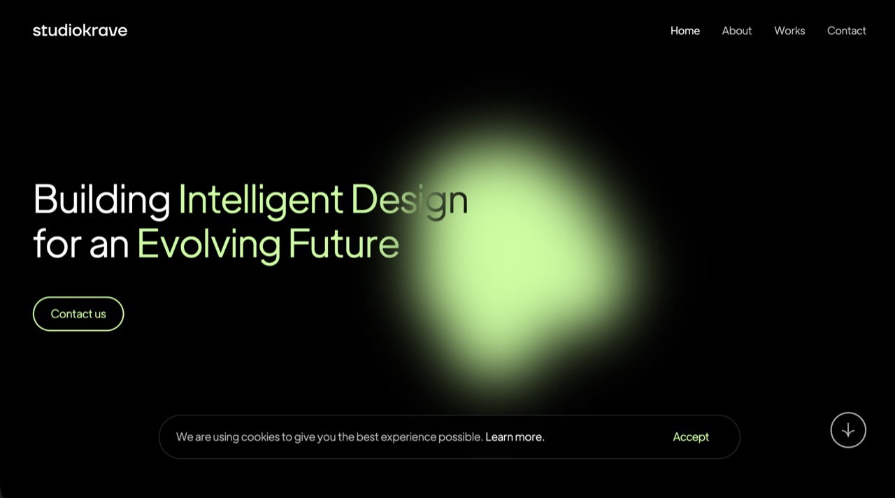
Studio Krave
Creative Studio · Brand Site
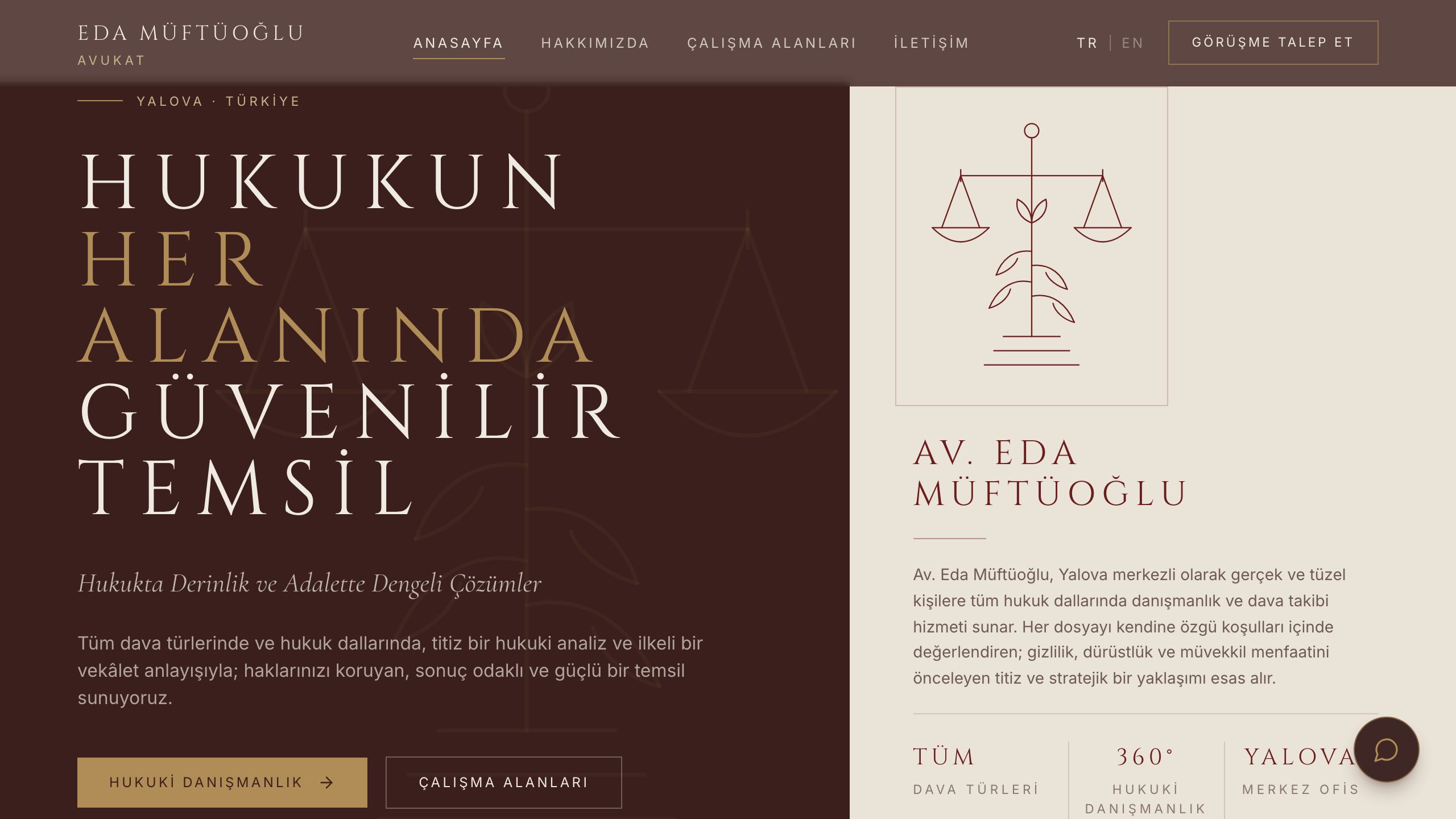
Eda Müftüoğlu
Law Office · Corporate Site
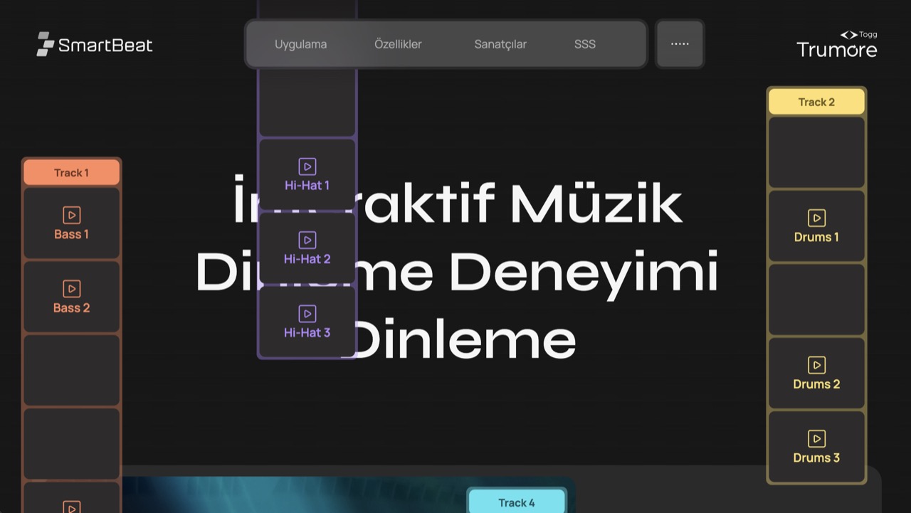
Smartbeat
Healthtech · App Marketing